Beverage world is a monthly magazine that deals with all things having to do with beverage drinks. From companies marketing strategies to the
politics surrounding the business. It also advertisies products relating to the beverage industry.
I think the colors used as well as the layout look timeless and would relate to any age group. I can see a difference in visual depth print quality compared to ads from the earlier years.
Monday, April 5, 2010
Wednesday, March 31, 2010
90's Ad
Wards AutoWorld is a monthly publication out of Overland park, Kansas. It focuses on everything relating to the automotive and engineering industry and the politics surrounding them.
The look of this publication looks very familiar. I think I may have seen it on the table at a local auto body shop while my car was being worked on. The layout of this cover has a modern feel. The bold heading along with the red across the top of the page is typical of many magazines of present day . There are several publications that I have seen use this similar layout almost as if it is a template. It being a 90's publication the images used are more crisp and current.
Friday, March 26, 2010
80's Contemporary
" American Film Magazine"
Created in 1975 by the american film institute. It is published monthly except combined for Jan.-Feb. and July-August. It covered what editors deemed most important. It focused on the past history that impinges on the present or as it did in the early 80's. Developments that will affect the future, the people who are deepening and defining the visual arts.
This particular cover resonates with me because it depicts images from one of the first movies that i can recall liking a lot. The 80's in my opinion marks a time when graphicaly designed images took on a more contemporary look and feel. This cover while simple and straightforward reminds me of something i would see in a magazine today.
Wednesday, February 10, 2010
Project2 copy
This is merely an example of the information i will use for my second project, there for words and images used here are completely subject to change.
What is “Trajan”?
Trajan is an old style Serif typeface and was first designed back in 1989 by Carol Twombly for Adobe. It is displayed as a Windows True Type font, and the Source Foundry is Linotype. Although there are many unofficial variations of the Trajan font, the official variations are owned by Adobe, such as Trajan Pro, and Trajan Pro Bold.
What does “Trajan” look like?
It is an easy to read font, and has hints of its Roman origins by its use of thin and thick constructive lines, giving the reader a feel of depth. Several letters have a flow in them, as can be seen in the letters J and R, but it is the Q that really catches attention as, unusually, it underlines the next adjacent letter creating a flow across the page.
The most unusual feature of Trajan is that it is in capitals only – when typing in lower case it uses slightly smaller caps than uppercase.
What is Trajan’s design origin?
The font itself is based on real Roman Square Capitals from ancient Italy, and received its name from Trajan’s Column in Rome, which was built in A.D.113.
However, the design of the Trajan font was by no means as simple as tracing Roman numerals and letters from ancient ruins, as lower case letter forms were not in use in Roman times. There is a more complete set of glyphs contained in Trajan Pro which is a 2001 update of the Carol’s original 1989 design, with a lower case set of small caps.
Where is Trajan used?
The frequency that Trajan is used in advertising and publications such as film posters and DVD titles has grown tremendously since its launch. It is now established as a film makers favorite.
There are many examples of best sellers that have based their headline publications on the use of the Trajan font, such as:
1. Font Designer - Carol Twombly, linotype.com
2. Trajan (typeface), Wikipedia
3. Trajan Regular, fonts.com
Monday, February 8, 2010
type photos/ Form & Content
This photo was taken from the Architectural record magazine, vol. 148 Oct.-Dec. 1970.
It is a advertisement by Krueger metal products inc. located in Wisconsin. The advertisement is of a chair known as the Castell which is a single chair that can be configured into 7 different concepts using accessory add ons. The layout and design of the ad is pretty straightforward and clean. A large photo of the chair is used in the center of the page to show its basic design before any accessory attachments have been added. The other six smaller photos show the chair with various attachments and are highlighted by different background colors to help the small photos pop off the light blue page. The positioning of the photos give the ad a good balance and helps in holding the viewers attention. Although several colors are used in conjunction with numerous photos the ad still remains uncluttered and easy to follow which is key for any advertisement. The biggest difference i can see in comparison to ads of the 1960's is cleaner higher resolution images.
Familiarity...
Longevity...
Expensive...
Eminence...
Resilient...
Full
Sporty...
Satisfied...
Monday, January 25, 2010
Friday, January 22, 2010
Form & content 1960's/ American artist
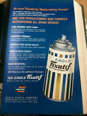
This is a advertisement out of American artist publication from 1960.
American artist was the largest art magazine circulation at the time.
What caught my attention about this ad were the colors and the layout. Everything is very straightforward and basic as are many ads from the 1960's. There always seems to be one dominate color constant throughout the advertisements, which is blue here. Other things that seem to be common in ads from the 60's and 70's is the look of being painted or drawn and being very wordy. Most of the ads I see from these time periods are either drawn or painted rather than the use of actual photos of products or people. Many ads also have a lot of information on them instead of being short and sweet. The layouts are very simple using mainly verticals and horizontal lines.
Subscribe to:
Posts (Atom)